Making Data Pretty
Beauty is in the Data, not the Tools
for the International Journalism Festival 2012
Dan Nguyen twitter: @dancow / @propublica
April 27, 2012
Shortlink: http://bit.ly/beautydata
for the International Journalism Festival 2012
Dan Nguyen twitter: @dancow / @propublica
April 27, 2012
Shortlink: http://bit.ly/beautydata
| Self-hosted | Third-party hosting |
|---|---|
i.e. there's more minutiae and technicalese to remember.
Even the best tools break (browser compatibility), go out of fashion (i.e. every interactive graphic made in Flash), or end up costing too much.
The best tools share the best patterns and intelligent design. If your visualization tool has a lot of arbitrary fickleness to it, there's probably a better tool out there.

What will always be the same is:
Let's go over a few visualization options, show how they share the same common steps, with small difference in details.
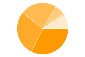
Open a data file, highlight the data, and click one of the Chart Wizards (sample data: March 2012 web browser usage share).
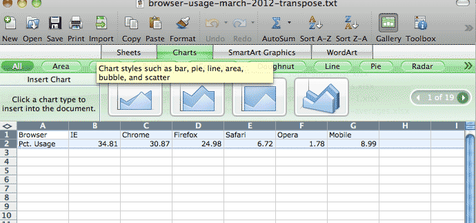
...and presto!
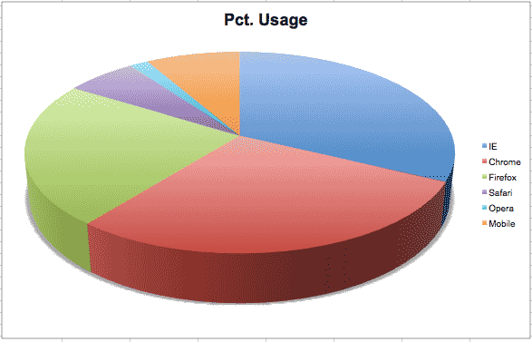
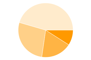
(pie charts – especially 3D ones – aren't considered the best visualization option, but you get the point)
Pros:
Cons:
Leaving the friendly point-and-click interface of Excel (or OpenOffice's or Google Docs' version of the spreadsheet) can be intimidating.
However, once you have the data in a proper format, you can port it to other visualization packages fairly easily.
Data is not determined by the program used to open and view it, whether it be Excel, Access, Fusion Tables, SQL Server, SAS, etc etc.
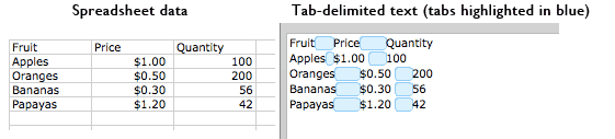
This Excel spreadsheet:
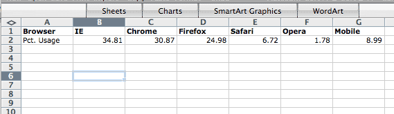
...is nothing more than this text file
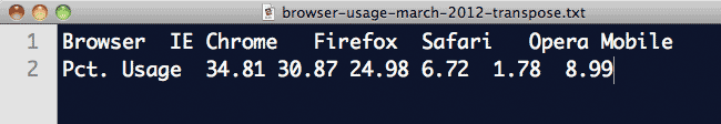
Data in a spreadsheet is nothing more than text separated by a common symbol (a.k.a delimiter), such as a comma, pipe |, or tab character.
Sometimes, switching from one tool to the other is as simple as doing a find-and-replace.
Excel interprets the tab characters in the text file as the column boundaries.
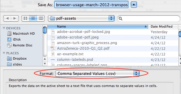
Save that file in Excel as .csv (comma-separated values), and the column boundaries are now commas.
One of the simplest online visualization options. Send the service a properly formatted URL; get back a chart as image file
All of the instructions are in Google's official documentation.
Read the pie-chart docs here
Start off with the URL for Google's service:
https://chart.googleapis.com/chart?
The resulting URL:
https://chart.googleapis.com/chart?cht=p&chs=300x200&chd=t:10,20,30,50
Creates this image:
https://chart.googleapis.com/chart?cht=p&chs=300x200&chd=t:10,20,30,50
The only thing that really matters is the actual data (e.g. 10,20,30,50) and the parameter it comes after (&chd=t:)
All the other parameters are just things to copy and paste.
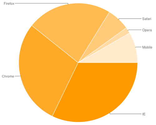
Using our previous dataset (March 2012 web browser usage share), we simply:
https://chart.googleapis.com/chart?cht=p&chs=300x200&chd=t:34.81,30.87,24.98,6.72,1.78,8.99
The result graphic:
We can add labels, as per the Google pie chart documentation:
https://chart.googleapis.com/chart?cht=p&chs=500x400 &chd=t:34.81,30.87,24.98,6.72,1.78,8.99 &chl=IE|Chrome|Firefox|Safari|Opera|Mobile
Pros
Cons
A JavaScript library for creating interactive graphics inside the web browser. It requires users to have JavaScript – which virtually every user does these days.
<script>
$(document).ready(function(){
var r = Raphael("pie-holder-simple");

var pie = r.piechart( 400, 300, 100,
	[34.81, 30.87, 24.98, 6.72, 1.78, 8.99]); // the data
});
</script>

<div id="pie-holder-simple" style="width: 500px; height: 400px;"></div>
	// (jQuery not required, per se, just used here for consistent sequence loading)
<script src='assets/lib/jquery-1.7.2.min.js'></script>
<script src='assets/lib/raphael-min.js'></script>
<script src='assets/lib/graphael/g.raphael-min.js'></script>
<script src='assets/lib/graphael/g.pie-min.js'></script>

<script>
$(document).ready(function(){
var r = Raphael("pie-holder");
var pie = r.piechart(
	350, 200, 150,
	[ 34.81, 30.87, 24.98, 6.72, 1.78, 8.99 ],
	{
	legend: ["IE", "Chrome", "Firefox", "Safari", "Opera", "Mobile"],
		legendpos: "east"
	}
);

pie.hover(function () {
 	this.sector.stop();
       this.sector.scale(1.1, 1.1, this.cx, this.cy);

                if (this.label) {
                    this.label[0].stop();
                    this.label[0].attr({ r: 7.5 });
                    this.label[1].attr({ "font-weight": 800 });
                }
            }, function () {
  	this.sector.animate({ transform: 's1 1 ' + this.cx + ' ' + this.cy }, 500, "bounce");

            if (this.label) {
                this.label[0].animate({ r: 5 }, 500, "bounce");
                this.label[1].attr({ "font-weight": 400 });
            }
        });

})

</script>

<div id="pie-holder" style="width: 600px; height: 500px;"></div>
After you see where your data parts go, including the headers (the legend), it's a matter of find-and-replace.
Sidenote: one of the best non-programming, data-related skills you can learn are regular expressions. All it takes is printing out a cheat sheet and putting it next to your monitor.
| Given: | IE Chrome Firefox Safari Opera Mobile |
| Find: | (.+?)\t |
| Replace: | "$1", |
| Result: |
"IE","Chrome","Firefox","Safari","Opera",Mobile |
Pros:
Cons:
A visualization is only as good as the quality and depth of its data.
Great visualizations naturally come from good data, just as great stories come from an abundance of reporting and interviews.
With good data, you don't need to resort to "chartjunk" – visualization elements that decorate over shallow data (just as filler quotes are used to pad a weak story)
Life expectancy for each country, taken from the World Bank's 2010 dataset. Country names have been removed for space considerations
https://chart.googleapis.com/chart?cht=bvs&chbh=a&chs=700x325&chd=t:48.3,76.9,72.9,50.7,75.6,73.8,81.7,80.4,70.5,75.2,68.6,76.6,70.4,79.9,75.8,55.6,79.3,66.9,66.3,75.4,53.1,73.1,73.5,54.9,49.9,62.5,51.1,80.8,73.8,47.6,49.2,78.9,73.3,73.4,60.6,48.1,57.0,79.2,54.7,76.5,79.4,77.4,79.1,73.2,75.5,73.0,71.7,50.8,61.0,75.4,58.7,69.2,79.9,81.4,62.3,58.2,73.3,80.0,63.8,80.4,75.7,70.8,53.6,47.7,69.5,61.8,72.8,82.9,74.2,81.5,65.1,68.9,68.5,80.3,81.5,81.7,72.8,82.9,73.3,68.3,56.5,80.8,69.9,69.4,67.1,73.5,72.4,47.4,56.1,73.3,80.1,80.8,74.6,66.5,53.5,74.0,76.6,51.0,80.9,58.2,73.0,76.7,68.8,68.9,68.2,74.3,71.9,49.7,62.1,68.4,80.7,73.7,54.3,51.4,81.0,65.2,76.0,62.4,72.3,73.8,68.5,76.2,79.0,78.9,73.5,68.8,55.1,72.3,64.3,73.9,59.0,73.9,73.0,47.4,81.6,75.1,79.4,67.5,52.1,81.6,74.7,74.4,72.1,61.1,48.3,81.5,82.2,75.7,67.3,57.4,73.9,62.0,56.6,72.2,69.8,74.6,73.7,64.9,53.6,70.3,76.6,80.4,78.2,76.2,68.0,70.8,74.1,74.8,65.0,48.5,49.9
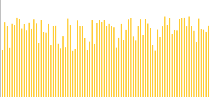
Even if country names were included, this is trivial information. Interesting at a glance, but so what?
Life expectancy (x-axis) and fertility rate (births per woman, y-axis)
https://chart.googleapis.com/chart?cht=s&chds=a&chs=600x325&chd=t:48.3,76.9,72.9,50.7,75.6,73.8,81.7,80.4,70.5,75.2,68.6,76.6,70.4,79.9,75.8,55.6,79.3,66.9,66.3,75.4,53.1,73.1,73.5,54.9,49.9,62.5,51.1,80.8,73.8,47.6,49.2,78.9,73.3,73.4,60.6,48.1,57.0,79.2,54.7,76.5,79.4,77.4,79.1,73.2,75.5,73.0,71.7,50.8,61.0,75.4,58.7,69.2,79.9,81.4,62.3,58.2,73.3,80.0,63.8,80.4,75.7,70.8,53.6,47.7,69.5,61.8,72.8,82.9,74.2,81.5,65.1,68.9,68.5,80.3,81.5,81.7,72.8,82.9,73.3,68.3,56.5,80.8,69.9,69.4,67.1,73.5,72.4,47.4,56.1,73.3,80.1,80.8,74.6,66.5,53.5,74.0,76.6,51.0,80.9,58.2,73.0,76.7,68.8,68.9,68.2,74.3,71.9,49.7,62.1,68.4,80.7,73.7,54.3,51.4,81.0,65.2,76.0,62.4,72.3,73.8,68.5,76.2,79.0,78.9,73.5,68.8,55.1,72.3,64.3,73.9,59.0,73.9,73.0,47.4,81.6,75.1,79.4,67.5,52.1,81.6,74.7,74.4,72.1,61.1,48.3,81.5,82.2,75.7,67.3,57.4,73.9,62.0,56.6,72.2,69.8,74.6,73.7,64.9,53.6,70.3,76.6,80.4,78.2,76.2,68.0,70.8,74.1,74.8,65.0,48.5,49.9|6.3,1.5,2.3,5.4,2.2,1.7,1.9,1.4,2.3,1.9,2.2,1.6,1.4,1.8,2.8,5.3,1.8,2.4,3.3,1.1,2.8,1.8,1.5,5.9,4.3,2.6,4.5,1.7,2.4,4.6,6.0,1.9,1.6,2.1,4.9,5.8,4.5,1.8,4.4,1.5,1.5,1.5,1.9,2.6,2.5,2.7,2.3,5.2,4.5,1.6,4.2,2.7,1.9,2.0,3.3,4.9,1.6,1.4,4.2,1.4,2.2,4.0,5.2,5.1,2.3,3.3,3.1,1.1,1.3,2.2,2.6,2.1,4.7,2.1,3.0,1.4,2.3,1.4,3.8,2.6,4.7,1.2,2.3,2.9,2.7,1.2,1.8,3.2,5.2,1.6,1.6,1.1,1.4,4.7,6.0,2.6,1.8,6.3,1.4,4.5,1.5,2.3,3.5,1.5,2.5,1.7,2.3,4.9,3.2,2.7,1.8,2.6,7.1,5.5,2.0,3.4,2.5,4.0,3.0,2.5,3.1,1.4,1.3,1.8,1.4,1.5,5.4,3.9,3.7,2.8,4.8,1.4,2.5,5.0,1.2,1.4,1.6,4.2,2.5,1.4,2.3,2.0,2.1,4.4,3.4,2.0,1.5,2.9,3.3,5.5,1.6,5.6,4.1,3.9,1.6,2.0,2.1,2.4,6.1,1.4,1.7,1.9,2.1,2.0,2.5,3.9,2.5,1.8,5.2,6.3,3.3
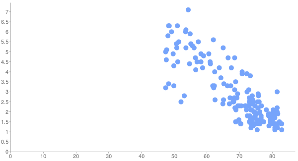
Shows an interesting correlation: "Living longer with fewer children," as Google's Public Data Explorer puts it.
Life expectancy, fertility rate, gross domestic product (dot-size)
Google has a URL-size limit, so not all countries are included here.
https://chart.googleapis.com/chart?cht=s&chxt=x,y&chds=a&chxs&chs=600x425&chd=t:49.9,48.1,56.1,47.4,53.5,58.7,54.3,61,49.7,66.5,53.6,47.6,58.2,48.3,53.6,56.6,57.4,68.4,55.1,54.9,47.7,49.9,51,62,61.8,68.6,49.2,60.6,55.6,62.5,56.5,67.3,69.4,47.4,65.2,59,58.2,73.7,51.1,54.7,67.1,64.3,74.8,48.5,67.5,51.4,65,63.8,68,62.4,65.1,61.1,68.9,66.3,72.8,66.9,68.5,68.2,74.7,68.5,73.3,68.8,73,71.9,72.3,70.8,75.7,70.8,68.9,69.5,57,70.3,73.8,69.9,72.3,73.8,72.2,71.7,48.3,76.9,69.2,64.9,75.5,75.8,74.6,75.4,73.3,50.7,74.6,73.3,72.9,73.9,73.2,73.9,72.8,62.1,73.8,70.5,70.4,76.6,73.4,73.5,72.1,74.3,74.4,52.1,53.1,75.7,73.5,76,73,79.2,74,62.3,75.6,68.3,76.7,72.4,73.7,68.8,73.1,73.5,73,73.3,76.2,76.2,78.9,74.2|4.3,5.8,5.2,5,6,4.2,7.1,4.5,4.9,4.7,5.2,4.6,4.9,6.3,6.1,4.1,5.5,2.7,5.4,5.9,5.1,3.3,6.3,5.6,3.3,2.2,6,4.9,5.3,2.6,4.7,3.3,2.9,3.2,3.4,4.8,4.5,2.6,4.5,4.4,2.7,3.7,1.8,6.3,4.2,5.5,5.2,4.2,2.5,4,2.6,4.4,1.5,3.3,3.1,2.4,3.1,2.5,2.3,4.7,1.6,3.5,2.7,2.3,3,4,2.9,3.9,2.1,2.3,4.5,1.4,1.7,2.3,3.9,2.4,3.9,2.3,3.4,1.5,2.7,2.4,2.5,2.8,2,1.1,1.6,5.4,1.4,3.8,2.3,1.6,2.6,1.4,2.3,3.2,2.5,2.3,1.4,1.8,2.1,1.5,2.1,1.7,2,2.5,2.8,2.2,1.4,2.5,1.5,1.8,2.6,3.3,2.2,2.6,2.3,1.8,2.1,1.5,1.8,1.2,2.5,1.6,2,1.4,1.9,1.3|192,199,247,325,339,358,358,403,410,421,452,457,466,501,509,523,524,525,530,536,580,595,602,624,671,675,676,736,749,795,795,820,847,1004,1019,1034,1044,1132,1147,1154,1177,1193,1224,1253,1261,1278,1300,1325,1381,1382,1410,1425,1631,1979,2026,2088,2140,2250,2375,2565,2621,2680,2698,2796,2840,2862,2893,2911,2946,2948,2970,3007,3031,3059,3117,3323,3349,3426,3502,3677,3708,3967,4008,4061,4199,4409,4428,4451,4461,4560,4567,4608,5215,5270,5275,5331,5401,5718,5765,6039,6240,6333,6466,6505,6884,7280,7403,7435,7539,7589,7591,7691,8373,8729,9124,9132,9133,9228,10094,10440,10710,10723,10766,11045,11633,12294,12431,12863
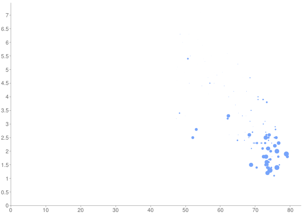
Another interesting, if obvious correlation. We've hit the upper-limit on what Google Static Charts can legibly display.
[dataset, Google Data Explorer docs]
Now you need to do something interactive – Google has its Data Explorer tool
(Comes close to information overload, but new interesting trends are revealed)
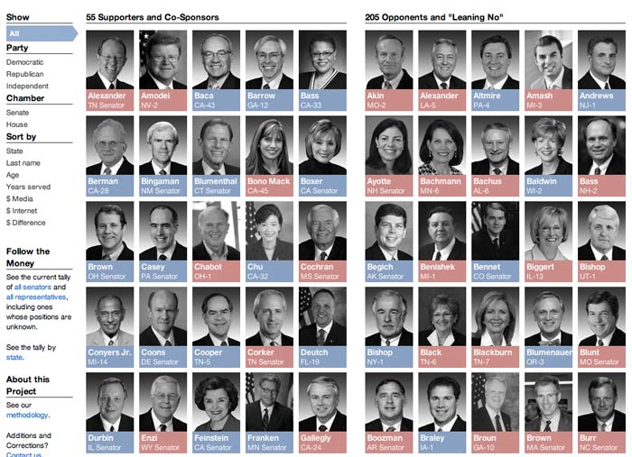
Concept: Show which U.S. congressmembers have taken a stand on the controversial SOPA bill.
This project, projects.propublica.org/sopa, has the record for one-day web traffic at ProPublica.
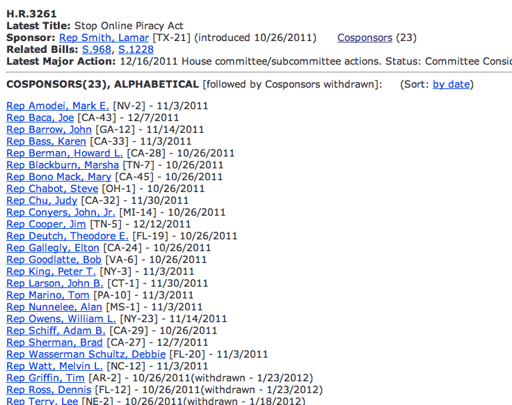
Easy to find data:
We can do better than a text listing:
Small multiples – the repetition of simple, data graphics for easy comparison. Coined by Edward Tufte.
Simple, but snazzy interactivity – isotope, a jQuery library used for dynamic sorting and filtering. By David DeSandro.
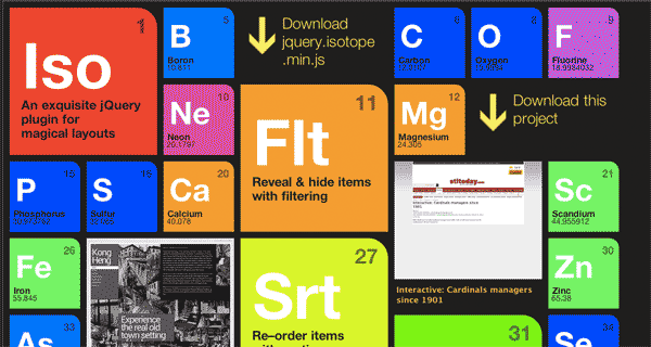
This next section contains all the steps needed to go from a simple spreadsheet to an interactive graphic.
It uses Google Charts and isotope.js...so some knowledge of HTML and JavaScript is needed to go beyond cut-and-paste.
But the main point of this exercise is to show how find-and-replace can move your data from one visualization tool to the other.
Regular expressions are like find-and-replace on steroids: they allow you to match patterns, not just exact words.
Regexes are one of the best all-purpose, never out-of-style concepts any data journalist can learn, without any need of programming skills. Just print out a cheat sheet.
Just a simple list of legislator names
Using just the first name and last name columns of the data
[data] / [interactive link]| Given: | Justin Amash Al Franken |
| Find: | (.+?)\t(.+) |
| Replace: | <li>$1 $2 </li> |
| Result: |
<li>Justin Amash</li> <li>Al Franken</li> |
(Eyes are drawn to faces)
 Justin Amash
  Michele Bachmann
  John Campbell
  Maria Cantwell
  Joe Baca
  Michael Bennet
  Jeff Bingaman
  Roy Blunt
  Mary Bono Mack
  Saxby Chambliss
  Christopher Coons
  Jim Cooper
  Bob Corker
  Dianne Feinstein
  Al Franken
  Kirsten Gillibrand
  Robert Goodlatte
 Using just the first name, last name, and image url columns of the data
[data] / [interactive link]| Given: | Justin Amash beauty-assets/members/50/A000367.jpg Al Franken beauty-assets/members/50/F000457.jpg |
| Find: | (.+?)\t(.+?)\t(.+) |
| Replace: | <li><img src="$3"> $1 $2 </li> |
| Result: |
<li><img src="beauty-assets/members/50/A000367.jpg"> Justin Amash </li> <li><img src="beauty-assets/members/50/F000457.jpg"> Al Franken </li> |
This is derived from official sponsorship list, voting history on related bills, and public statements. Same regex as before, just moving the HTML around.
Joe Baca Michael Bennet Jeff Bingaman Roy Blunt Mary Bono Mack Saxby Chambliss Christopher Coons Jim Cooper Bob Corker Dianne Feinstein Al Franken Kirsten Gillibrand Robert Goodlatte Justin Amash Michele Bachmann John Campbell Maria Cantwell Many anti-SOPA activists assumed that SOPA was a Republican initiative. A simple color-key visualization of party membership showed otherwise.
 Howard Berman Robert Goodlatte Roy Blunt
  Kelly Ayotte
  Richard Blumenthal
  Lamar Smith
  Robert Menendez Dianne Feinstein
  Ben Quayle
  John Carter Mary Bono Mack Al Franken
  Steven Chabot
  David Vitter
  Lee Terry
  Ron Wyden
  Anna Eshoo
  Zoe Lofgren
  Mike Lee
  Jerry Moran
 This requires the use of CSS to set the colors. So, something like:
<style>
	li.R{
		background: #FFB2AC;
	}

	li.D{
		background: #C3D7FA;
	}
</style>
Regular expression [data] / [interactive link]
| Given: | Justin Amash beauty-assets/members/50/A000367.jpg N R Al Franken beauty-assets/members/50/F000457.jpg Y D |
| Find: | (.+?)\t(.+?)\t(.+?)\t(.+?)\t(.+) |
| Replace: | <li class="$4 $5"><img src="$3"> $1 $2 </li> |
| Result: |
<li class="N R"><img src="beauty-assets/members/50/A000367.jpg"> Justin Amash </li> <li class="Y D"><img src="beauty-assets/members/50/F000457.jpg"> Al Franken </li> |
OpenSecrets/Center for Responsive Politics classifies campaign contribution data by industry/job of the contributor. Adding this datapoint lets us infer the nature of each candidate's support base.

[data] / [interactive link]
| Given: | Barbara Boxer beauty-assets/members/50/B000711.jpg Y D 571600 348691 Charles Schumer beauty-assets/members/50/S000148.jpg Y D 494325 291384 |
| Find: | (.+?)\t(.+?)\t(.+?)\t(.+?)\t(.+?)\t(.+?)\t(.+) |
| Replace: | <li class="$4 $5"> <div class="name">$1 $2</div> <img src="$3" alt="mug"> <img src="https://chart.googleapis.com/chart?cht=p&chs=100x80&chds=a&chd=t:$6,$7" alt="E: $6 / I: $7" data-entertainment="$6" data-internet="$7"> </li> |
| Result: |
<li class="Y D"> <div class="name">Barbara Boxer</div> <img src="beauty-assets/members/50/B000711.jpg" alt="mug"> <img src="https://chart.googleapis.com/chart?cht=p&chs=100x80&chds=a&chd=t:571600,348691" alt="E: 571600 / I: 348691" data-entertainment="571600" data-internet="348691"> </li> <li class="Y D"> <div class="name">Charles Schumer</div> <img src="beauty-assets/members/50/S000148.jpg" alt="mug"> <img src="https://chart.googleapis.com/chart?cht=p&chs=100x80&chds=a&chd=t:494325,291384" alt="E: 494325 / I: 291384" data-entertainment="494325" data-internet="291384"> </li> |
This is cake. The hard visualization work is done by jQuery and David DeSandro's isotope library, which we include in the HTML.
The rest is some CSS to make things look nice. And then regular expressions + find-and-replace to get the data in the correct HTML form.
Final result is here.
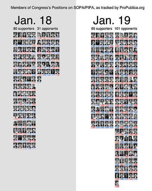
While collecting the politicians' positions, I also noted the date of a position change.
With that extra datapoint, creating this static variation of the main graphic took about 2 minutes and was the most popular visualization of the data.
Visualizations start with the data, so become skilled at finding (research), collecting (web scraping/FOIAing), and cleaning (regular expressions, Google Refine, programming) data.
The best visualization tools are often the ones that are easiest to pick up and use. They should not involve learning a lot of non-transferrable minutiae.
Every tool breaks. So spend time improving your overall data and design skills, and less time worrying about mastering a tool.
for the International Journalism Festival 2012
Dan Nguyen twitter: @dancow / @propublica
April 27, 2012
Shortlink: http://bit.ly/beautydata
Slide format courtesy of Google's html5slides